Prototyping: From vision to product
Turn abstract thoughts into concrete, presentable concepts - we show you how

Step by step to the prototype
What do a museum building and an app or website have in common? Very simple: In the beginning there is a vision. This is realized step by step with prototyping. In this blog post, I will tell you how this works.
In the beginning was the idea
Without an idea there is no campaign, no product, no service. But many visions fail early on. The challenge is to make this vision tangible and understandable. This is a challenge even for the most renowned specialists in the world. For example for the architect and designer Frank Gehry. He was commissioned by billionaire Bernard Arnault to create an "extraordinary place for art and culture". Using prototyping, Gehry developed the "glass cloud" - the building of the Fondation Louis Vuitton. What does this have to do with the digital world? Here too, prototypes are essential for the development of products and services.
What is prototyping?
In general, prototyping is understood as the approach to a product or service. In this method, the desired properties of the product are checked with low-cost, inexpensive advance copies. The method has its roots mainly in architecture and industry.
What are the advantages of the procedure?
Prototypes turn abstract thoughts into concrete, presentable concepts. In short: prototyping is the way to create ideas you can touch. The effort is comparatively low and the advantages are obvious. If you don't have to explain your ideas for a long time, decisions can be made more quickly and misunderstandings can be avoided. Any change requests from the client can be implemented at an early stage. This saves time and money, which are usually tight in projects. Since prototypes in the digital field are created in cooperation with the client, a better working relationship with the customer is often a positive side effect.
How does prototyping for digital products work?
Before the actual prototyping begins, some preliminary work is necessary. First of all, the team needs all available details of the project:
- What is the actual challenge?
- What is the budget?
- What is the composition of the target group?
- What is the most important event in the customer journey?
- What are the risks?
- Are there any other specifications?
If the vision is very unspecific, interviews with various people on the client side - e.g. customer advisors, marketing managers, etc. - provide information about the actual goals. This is how the important issues of a digital solution crystallize. A prototype can be created for each topic.
All the information collected in advance flows into a storyboard containing 15 to 20 pictures. The storyboard forms possible screens and touchpoints as well as the context of the service or product.
The prototyping team
Ideally, 5-8 people form the core team. This should critically analyze the prototype from three perspectives - namely business, user and technology. The team needs the following key roles in any case:
- Decision makers (analogous to the Product Owner at Scrum)
- Moderator (analogous to the Scrum Master for Scrum)
- Representatives of the user perspective (e.g. designers, customer consultants, etc.)
- Representatives of the technology (e.g. backend engineer, frontend engineer, etc.)
- Representatives of the business role (e.g. management, product manager, etc.)
As with other projects, the same applies in the digital context: the prototypes become more and more accurate during the process with regard to their similarity to the final product. This includes aspects such as font, color scheme and other branding details. This similarity is also known as fidelity. A distinction is made between the following stages:
- low fidelity
- mid fidelity
- high fidelity
Level 1: Low fidelity
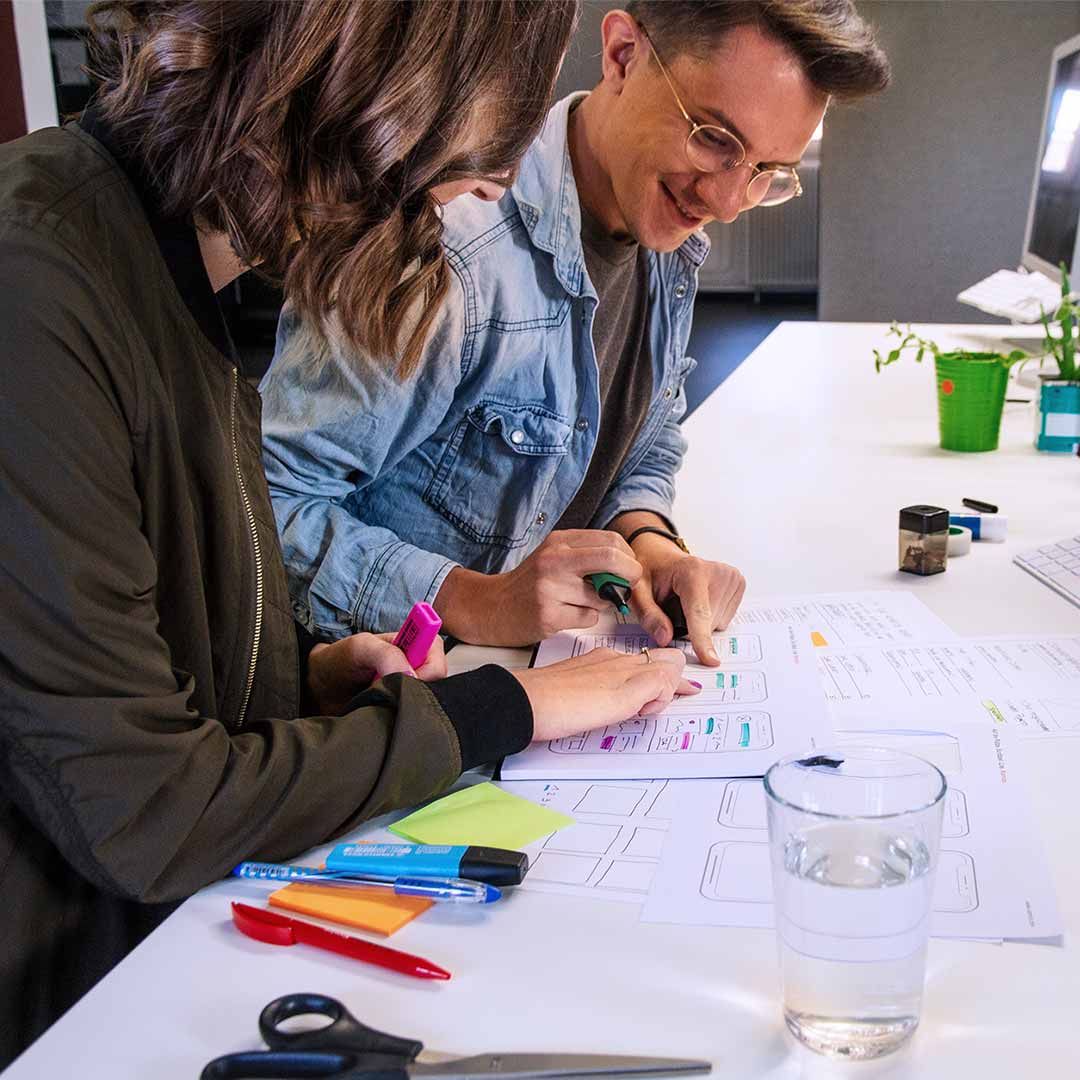
Low-fidelity includes the so-called solution sketch. This is the first prototype. It is supposed to tell a story and is often first recorded on paper. Each participant creates his own Solution Sketch, which is kept relatively simple. The team then comes together to decide on the prototypes. Everyone has the chance to look at all the prototypes in peace and quiet. The participants mark questions and aspects that they find particularly exciting. These highlights are very helpful in finding solutions: The best aspects can be easily transferred to the next stage or the next prototype. All steps and necessary screens are recorded in a new storyboard.
Level 2: Mid fidelity
Before creating the next prototype, the team decides on suitable tools (e.g. Figma or Sketch, more examples follow below). Another element of the mid-fidelity stage is the time boxing: Resources and planned content are based on the time still available. Afterwards, the next prototype is built together on the PC. Then the user test and/or stakeholder presentation can be carried out. During the user test, cameras record the facial expressionsof the test subjects - and thus reveal their emotions. It is best if other team members evaluate them live in a separate room. Ultimately, all evaluations flow into a large matrix with test persons and screens. This is then analysed to identify potential for improvement.
Level 3: High fidelity
In the final step, the participating designers adapt style guides and branding. Based on the results of the user tests, they revise the user interface. The final touches are also made to icons and animations.
These tools help in the creation of digital prototypes:
Three professional tips for prototyping
- Exact documentation: Prototyping sometimes tempts people not to record concrete agreements. But this is exactly what is important to make progress and reduce unnecessary discussions.
- It's the mix that does it: Ideally, team phases alternate with steps in which the members work alone.
- User tests: The team can identify 85% of usability problems with just five test subjects.
For me it is clear: prototyping is a state of mind.
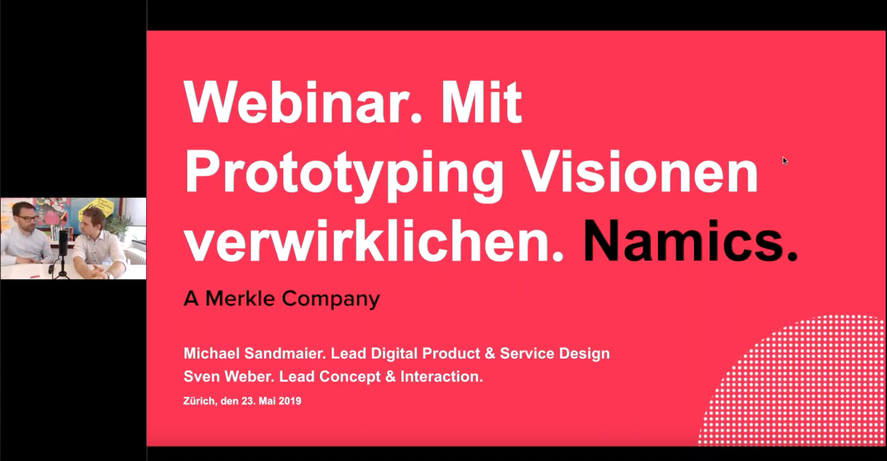
Would you like more tips and practical examples of prototyping? Then watch the recording of our webinar now:
We also make your product visions tangible. Learn more about Digital Product & Service Design at Merkle and contact us.


